


Advice for Logo
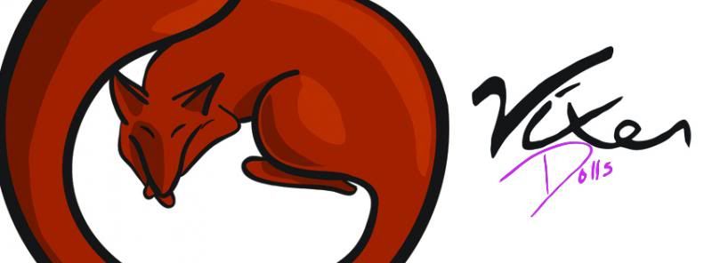
This isn't in relation to a T-Shirt, yet and won't likely be a submission for this site but it is something I am working on for a friend and want some tips. The font is really what I am looking to get advice on. I had drawn in in originally but I have seen it as the logo for so long that I like the way it looks, but I know that doesn't necessarily mean it looks good at all. So any thoughts would be greatly appreciated but i am looking specifically for thoughts on the lettering itself. The image with the entire logo viable is just very basic font as a place holder.
FoodStampDavis
Crossling
FoodStampDavis
bitemefox
RAIL-GUN
melmike
Gutter_Kreep
GAZPACHO
gebe
aqsmorningview